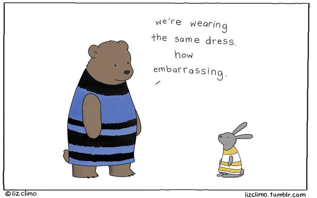
Is this logo blue and black, or white and gold?

Crazy huh? Dress ooked Gold and White to me.
That logo looks light Blue and Brown to me!
Blue and black goes well with mymonero and my presentation but this is quite a change. Orange is the color of "boldness", blue is much less vindicative. For this reason, I prefer orange, it grew on me.
Also, orange was chosen by artists and another artist warned us about letting non-artist decide about esthetism
Finally, none of the se color schemes blend well with the getmonero.org color scheme.
lol David...

This thread is a reference to what's been going on on the Internet the last few days: http://www.wired.com/2015/02/science-one-agrees-color-dress


